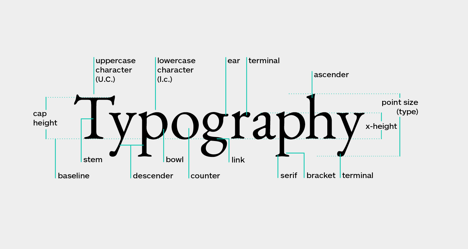
88themovie.com – Typography is the art and technique of arranging type to make written language legible, readable, and appealing when displayed. It is one of the most critical elements in design, having the power to convey not just literal meaning but also tone, attitude, and intentionality. Good typography can elevate a design, making it more engaging, memorable, and effective. This article explores the fundamental principles of typography and how it can be used to enhance design.
The Fundamentals of Typography
1. Typefaces and Fonts
A typeface is a designed set of characters, including letters, numbers, and symbols, that share a common design. A font, on the other hand, is a specific size, weight, and style of a typeface. Understanding the differences between typefaces and fonts is crucial for effective typography.
2. Hierarchy
Typographic hierarchy is the use of size, weight, and style to organize type and content in a way that guides the reader’s eye and communicates the relative importance of different elements. Establishing a clear hierarchy is essential for readability and visual interest.
3. Legibility and Readability
Legibility refers to the ease with which individual characters can be distinguished, while readability refers to the ease with which text can be read and understood in larger blocks. Choosing appropriate typefaces, sizes, and line spacing are key factors in ensuring both legibility and readability.
4. Alignment
Alignment refers to the arrangement of text in relation to the edges of the design space. Proper alignment can create a sense of order and harmony, making the design more cohesive and visually appealing.
5. Contrast
Contrast in typography involves the use of different typefaces, sizes, colors, and weights to create visual interest and highlight important information. Effective use of contrast can make a design more dynamic and engaging.
Typography in Design
1. Branding
Typography plays a crucial role in branding, as the choice of typeface can significantly influence the personality and perception of a brand. A well-chosen typeface can convey the brand’s values, tone, and unique selling proposition.
2. Editorial Design
In editorial design, such as magazines, books, and newspapers, typography is used to organize content, create a reading rhythm, and enhance the overall aesthetic. The choice of typefaces, layout, and hierarchy are critical in making the content accessible and enjoyable to read.
3. Web Design
Typography in web design is about more than just making text readable on a screen. It involves creating a user-friendly experience, guiding the user’s attention, and enhancing the overall design aesthetic. Responsive design and accessibility are also key considerations in web typography.
4. Advertising
In advertising, typography is used to grab attention, communicate messages quickly and effectively, and evoke emotions. The creative use of typefaces, sizes, and layouts can make an advertisement more impactful and memorable.
The Importance of Typography
Typography is not just about making text look good; it’s about enhancing communication. Good typography ensures that the intended message is conveyed clearly and effectively, while also adding aesthetic value to the design. It can influence how viewers perceive and interact with the content, making it a powerful tool in the designer’s arsenal.
Conclusion
The art of typography is a fundamental aspect of design that can significantly enhance the effectiveness and appeal of any project. By understanding and applying the principles of typography, designers can create more engaging, readable, and visually striking designs. Whether it’s through the choice of typefaces, the establishment of hierarchy, or the use of contrast and alignment, typography is a versatile tool that can elevate design to new heights.
